Monday, August 28

Nokia Design Contest

Hello everyone, my name is Rob.....and I am a Cellophile.

I hate, hate the design of my current flip phone. Its hideous design has brought me to a borderline obsession with phones of good design. This cellphone concept is utilizes modern design elements and doubles as a mouse! I've been waiting and waiting for cellphone companies to make phones the double as bluetooth mice.

-r

Tuesday, August 22

matthew barnes.


MATTHEW BARNES / battles.co.uk

very nice illustration and design by matthew barnes

f.

What the future will look like, or be seen through


basically an OLED is an organic light emitting diode. What allows this display to be so thin and flexible is because unlike current LCD technology(liquid crystal) OLED's do not need a backlight to give them brightness or color. Because the pixels that make up the display's are organic, the advantages of using are better energy efficiency, simple inkjet print like reproduction and thinner screen sizes. Unfortunately saturated colors like blue, are difficult to achieve and result in a shortened lifetime.

Monday, August 21

Symantecs, I know.


Not another mac/pc comparison! but seriously guys, hear me out. For a while now I've been working back and forth between with the latest mac OS and windows XP, so I am going to review them from a GUI (graphical user interface) stanpoint alone. I don't know if it has been done, but as a user and a designer, how the interface looks and works is very important to me. I'm not going to talk about software, or hardware... just the look and feel.

PC pros:
  • Full-Directional Window Scalability (Macs can only scale windows with the bottom right corner and can't expand windows vertically)
  • File Explorer/Internet Explorer (XP's File Explorer has a textfeild that shows the file string that can also open web pages)
  • Taskbar Hiding (Macs can hide the dock menu but can’t hide the taskbar)
  • Application prompt button navigation (being able to answer a question your computer tasks you using the only the keyboard)
Mac Pros:
  • Window Shading (mac windows cast a shadow giving a dimension layering, mac menus are also transparent allowing sight beneath selected menu items)
  • Icon Sizing and Customization (mac icons can be uniformly scaled to whatever pixel-by-pixel dimension(from 16-128), changing individual icon appearances is a simple cut and past job)
  • Component Customization (mac OS allows users to decide which shortcuts and buttons are shown in the finder toolbar)
  • Dock (Allowed most control over size and positioning)
  • List View (File display option that allows users to navigate through files without double clicking each one)
  • Spotlight (10x better than XP's seach tool, make that 100x)
  • Force Quit (being able to quit out of an app quickly instead of exiting the system, like say when you open a file in the wrong prog... not having to wait for the prog to load all the way just to close it)
  • Vertical Window boundary (I don't know how it happens, I just hate in XP when the window close buttons are out of my mouse's tiny reach )
  • App files (having(most) applications contained in a bundled icon makes it REALLY easy to uninstall and use)
  • Sub Window Hiding (you know those satellite windows in photoshop? yeah, they don't go away in XP when you switch programs)
  • Hot Key for making a New Folder
so far that is all I can think. I know many of you will read this list and say none of this stuff matters, but I can tell you then make the world of difference when you have to go back and forth. I would say the devil is in the details, and the mac OS has Lucifer at bay.

for those of you who actually read this... here is a list of parody videos that portrays operating systems as humans BETTER than the apple adds.

1, 2, 3, 4, 5, 6

-r

muji house.


my favorite brand muji makes house now. so exciting.
i loooooooove muji brand because their items are all simple and modern. plus it's cheap and recycled!
anyway. i will definitely introduce more neat stuff on muji products later, but today, i would like to tell you about the house.

this house is also known as "木の家 (ki-no-ie = wood house).
made mostly in wood and simple box shaped house. a lot of people wonders and ask "why aren't there any walls? wouldn't that make the house structure weak?" the answer is no, they used special structure called SE structure and made the structure of the house stronger. also by using SE structure, it would creates more space for the house, which is the key point of the house. most houses we live use walls, so that the stucture of the house will be stronger, but that makes the space of the house smaller.


another awesome thing about this house is house temperatures during winter/summer. this house will use the natural energy like solar power. it will keep the warmth in the house (this natural energy will not only warm the air up, it will also warm up people/floor/wall from natural energy) and if you wanted to let the air out, there will be a air-bent in the back of the house and it can let the warm air escape. also it wouldn't cause any dust to come in house for people with dust allergy.

best part of this house is the design. this house will go either in the city or forest areas, and still look great.
the starting price for this house is 19,470,000 yen (approx: $185,000).
basic plan cost, demention of the house and other info : HERE

for more information :::
(it's in japanese and i tried my best to translate) (;ω;)
you can check HERE.
and if you ever get a chance to go to japan, there will be multiple model houses in muji stores and you can check the house out.

f.

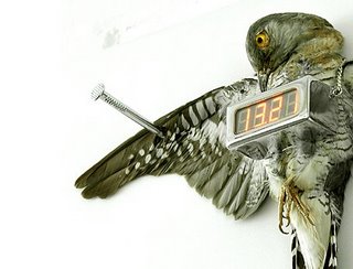
Clockafixion


Michael Sans designed this shocking wall clock design that really reinvents the meaning of cuckoo clock. The clock’s uses of powerful symbols will likely result in mixed reactions, however the design is very thoughtful and evocative. No doubt it would make a great conversational piece. Sans also has a wonderful website with a diverse multitude of design work.

-r

Thursday, August 17

mansi shah


MANSI SHAH

Interesting and fun graphic design.
check more at the site. they have more interesting graphic design and typography.

f.

Tuesday, August 15

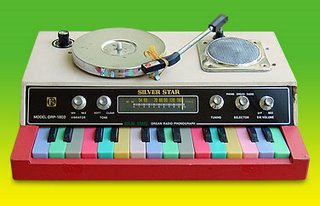
Miniorgan


MINIORGAN

I used to collect/buy toy keyboards from used stores and I loved playing silly music/noise with them. anyway....This site shows wonderful rare and vintage musical electronic toys collection. Most of them are from the 70ies and 80ies. Eric (from miniorgan) said "This is the first museum of lost organs, damned keyboards, childish synthesizers, dusty voice transformers and singing calculators. Maybe you remember some from your own childhood, but I'm sure you haven't seen most of them in your life. Enjoy watching my constantly growing collection of these little beeping creatures and write me if you like."

enjoy!

f.

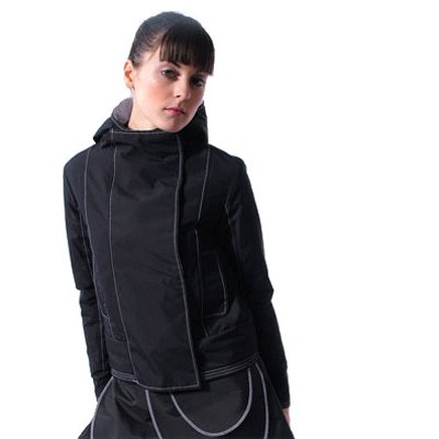
Turbow, MAKE ME A SPACE JACKET!


HERE YE, HERE YE! May all bear witness to the amazing fashion of Rebecca Turbow! Turbows forward thinking modern design approach is a seamless blend of my favorite fashion. Her clothing is reminiscent of females’ costumes worn old British spy flicks combined with an overall naturalistic sensibility. But with a name like Turbow, I'm sure it isn’t hard to stay ahead of the fashion game. Sorry guys, she only works in women’s’ wear... guess I'll have to start cross-dressing.

check out her wonderful site


-r-

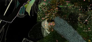
Oculart


OCULART

Very dark (kind of creepy but i love that!) with awesome experimental music by Geoff Lillemon. He is a Boston based surrealist artist who makes these very interesting videos using Flash. Please check his amazing videos.

f.

Monday, August 14

Sam fucking Weber


So for the past year or so I have been religiously checking Sam Weber's page and I honestly can’t say enough good things about his work. Stylistically he is my current favorite because his use of bold strokes, clean lines and subtle use of color. I also find the subject matter intriguing paired with the intense emotions in each work particularly captivating. Needless to say he has been a huge inspiration for me. People see my desktop and ask me, "did you draw that?" to which I always reply, "I wish."

heres a site link

-r-

Sunday, August 13

Radiograph


RADIOGRAPH.

Very nice graphic design/illustration by Yoshi Tajima.
(also very nice site!)

f.