Wednesday, April 25
Monday, February 5
Nazario Graziano / NGDesign

Nazario Graziano / NGDesign
I am sucker for designs like Nazario Granziano's work! I love it!
He is an italian based graphic/web designer and art director!
I like the use of hand-drawn illustration, collages with design all together.
He uses beautiful colors, very soft and calming to very eye capturing bright colors.
In his work, he uses the mixture of human anatomy, mechanical objects and nature to create collages.
His typography goes along with his designs, ahhhh i love it!
please check it out!
f.
Sunday, February 4
Adium 1.0 kicks so much ass
For those of you who aren't in the know, Adium is a free instant messaging application for Mac OS X that can connect to AIM, MSN, Jabber, Yahoo, and more.
I've always liked Adium, but i was never fully satisfied with the application for the most part because of the instability when sending files. before 1.0 it seemed like 90% of the time i would have to switch to ichat to get a complete transfer. The new version has of coarse fixed this problem as well as added some needed features.
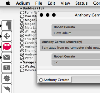
Adium's buddy list and message window are completely customizable and people are constantly creating new extras. For example, I prefer a very small minimal contacts list so the program blends in with the background and doesn't interfere with the other programs i am using. I was able to install the plugin from the Adium site without ever having to open an install window or anything. The contact list is 1/4 the size of my iChat list, and that is with 15 contacts online! Most important of all, Adium supports tabbed conversations like safari's browsing. i know this is not a new concept, but tell that to the iChat developers... Adium still lacks voice and video chat capabilities, which would be the only thing i find missing from this fine piece of app.
-r
I've always liked Adium, but i was never fully satisfied with the application for the most part because of the instability when sending files. before 1.0 it seemed like 90% of the time i would have to switch to ichat to get a complete transfer. The new version has of coarse fixed this problem as well as added some needed features.

Adium's buddy list and message window are completely customizable and people are constantly creating new extras. For example, I prefer a very small minimal contacts list so the program blends in with the background and doesn't interfere with the other programs i am using. I was able to install the plugin from the Adium site without ever having to open an install window or anything. The contact list is 1/4 the size of my iChat list, and that is with 15 contacts online! Most important of all, Adium supports tabbed conversations like safari's browsing. i know this is not a new concept, but tell that to the iChat developers... Adium still lacks voice and video chat capabilities, which would be the only thing i find missing from this fine piece of app.
-r
Wednesday, November 22
Tuesday, November 7
my throwback panasonic head phones
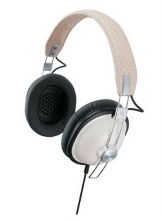
I just bought some new head phones from fry's. These things are great. They sound great and look good too. I also like how the foam padding creates a large enough cavity to house my ears instead of SMASHING them against the speaker. The RP-HTX7 headphones come in a few stylish colors and are a pretty good deal for 60 bucks. Drawbacks... they don't fold up so they aren't easily stored.
Friday, September 1
Lousy Livin Company
LIVING COMPANY or THE LOUSY LIVINCOMPANY
another cool illustration and design site. skateboards, books, t-shirts etc!
checkie out.
f.
Murgraph
MURGRAPH
very colorful! and very unique illustration/graphic designer Akinori Shimodaira from Japan.
I think he works in watercolor and some markers? i've been fan of his work for quite a while.
he also do illustrations for the band called Kiiiiiii (very cute japanese girls band).
he recently released his wallet design at poketo as well.
please check it out!
f.
Monday, August 28
Nokia Design Contest
Hello everyone, my name is Rob.....and I am a Cellophile.
I hate, hate the design of my current flip phone. Its hideous design has brought me to a borderline obsession with phones of good design. This cellphone concept is utilizes modern design elements and doubles as a mouse! I've been waiting and waiting for cellphone companies to make phones the double as bluetooth mice.
-r
Tuesday, August 22
What the future will look like, or be seen through
basically an OLED is an organic light emitting diode. What allows this display to be so thin and flexible is because unlike current LCD technology(liquid crystal) OLED's do not need a backlight to give them brightness or color. Because the pixels that make up the display's are organic, the advantages of using are better energy efficiency, simple inkjet print like reproduction and thinner screen sizes. Unfortunately saturated colors like blue, are difficult to achieve and result in a shortened lifetime.
Monday, August 21
Symantecs, I know.

Not another mac/pc comparison! but seriously guys, hear me out. For a while now I've been working back and forth between with the latest mac OS and windows XP, so I am going to review them from a GUI (graphical user interface) stanpoint alone. I don't know if it has been done, but as a user and a designer, how the interface looks and works is very important to me. I'm not going to talk about software, or hardware... just the look and feel.
PC pros:
- Full-Directional Window Scalability (Macs can only scale windows with the bottom right corner and can't expand windows vertically)
- File Explorer/Internet Explorer (XP's File Explorer has a textfeild that shows the file string that can also open web pages)
- Taskbar Hiding (Macs can hide the dock menu but can’t hide the taskbar)
- Application prompt button navigation (being able to answer a question your computer tasks you using the only the keyboard)
- Window Shading (mac windows cast a shadow giving a dimension layering, mac menus are also transparent allowing sight beneath selected menu items)
- Icon Sizing and Customization (mac icons can be uniformly scaled to whatever pixel-by-pixel dimension(from 16-128), changing individual icon appearances is a simple cut and past job)
- Component Customization (mac OS allows users to decide which shortcuts and buttons are shown in the finder toolbar)
- Dock (Allowed most control over size and positioning)
- List View (File display option that allows users to navigate through files without double clicking each one)
- Spotlight (10x better than XP's seach tool, make that 100x)
- Force Quit (being able to quit out of an app quickly instead of exiting the system, like say when you open a file in the wrong prog... not having to wait for the prog to load all the way just to close it)
- Vertical Window boundary (I don't know how it happens, I just hate in XP when the window close buttons are out of my mouse's tiny reach )
- App files (having(most) applications contained in a bundled icon makes it REALLY easy to uninstall and use)
- Sub Window Hiding (you know those satellite windows in photoshop? yeah, they don't go away in XP when you switch programs)
- Hot Key for making a New Folder
for those of you who actually read this... here is a list of parody videos that portrays operating systems as humans BETTER than the apple adds.
1, 2, 3, 4, 5, 6
-r
muji house.
my favorite brand muji makes house now. so exciting.
i loooooooove muji brand because their items are all simple and modern. plus it's cheap and recycled!
anyway. i will definitely introduce more neat stuff on muji products later, but today, i would like to tell you about the house.
this house is also known as "木の家 (ki-no-ie = wood house).
made mostly in wood and simple box shaped house. a lot of people wonders and ask "why aren't there any walls? wouldn't that make the house structure weak?" the answer is no, they used special structure called SE structure and made the structure of the house stronger. also by using SE structure, it would creates more space for the house, which is the key point of the house. most houses we live use walls, so that the stucture of the house will be stronger, but that makes the space of the house smaller.
another awesome thing about this house is house temperatures during winter/summer. this house will use the natural energy like solar power. it will keep the warmth in the house (this natural energy will not only warm the air up, it will also warm up people/floor/wall from natural energy) and if you wanted to let the air out, there will be a air-bent in the back of the house and it can let the warm air escape. also it wouldn't cause any dust to come in house for people with dust allergy.
best part of this house is the design. this house will go either in the city or forest areas, and still look great.
the starting price for this house is 19,470,000 yen (approx: $185,000).
basic plan cost, demention of the house and other info : HERE
for more information :::
(it's in japanese and i tried my best to translate) (;ω;)
you can check HERE.
and if you ever get a chance to go to japan, there will be multiple model houses in muji stores and you can check the house out.
f.
Clockafixion

Michael Sans designed this shocking wall clock design that really reinvents the meaning of cuckoo clock. The clock’s uses of powerful symbols will likely result in mixed reactions, however the design is very thoughtful and evocative. No doubt it would make a great conversational piece. Sans also has a wonderful website with a diverse multitude of design work.
-r
Thursday, August 17
mansi shah

MANSI SHAH
Interesting and fun graphic design.
check more at the site. they have more interesting graphic design and typography.
f.

